FULLERTON COMMUNITY COUNSELING
Curating the Counseling Experience
Curating a counseling website to be more modern and in alignment with their new brand, attract new site visitors, and increase conversion rates
Team
UX/UI Designer (Cathy Duong)
UX Researcher (Yasmin Yahini)
Tools
Figma
Zoom
Google Survey
Miro
Wix
Time
5 Months
Concerns about a disorganized and unprofessional website
Our client was concerned that their current website appeared disorganized and unprofessional. They wanted us to refresh their website and help them develop a brand and style that best represented their new image. Some of the keywords that described our client’s vision for their new website were:
Professional
Polished
Simple
Clean
Old UI
Basing design goals on users, business, and product needs
User: Find right therapist and receive therapy services
Business: Increase site visitors and conversion rate
Product: Establish brand and style
How did users feel about therapy websites?
User Insights
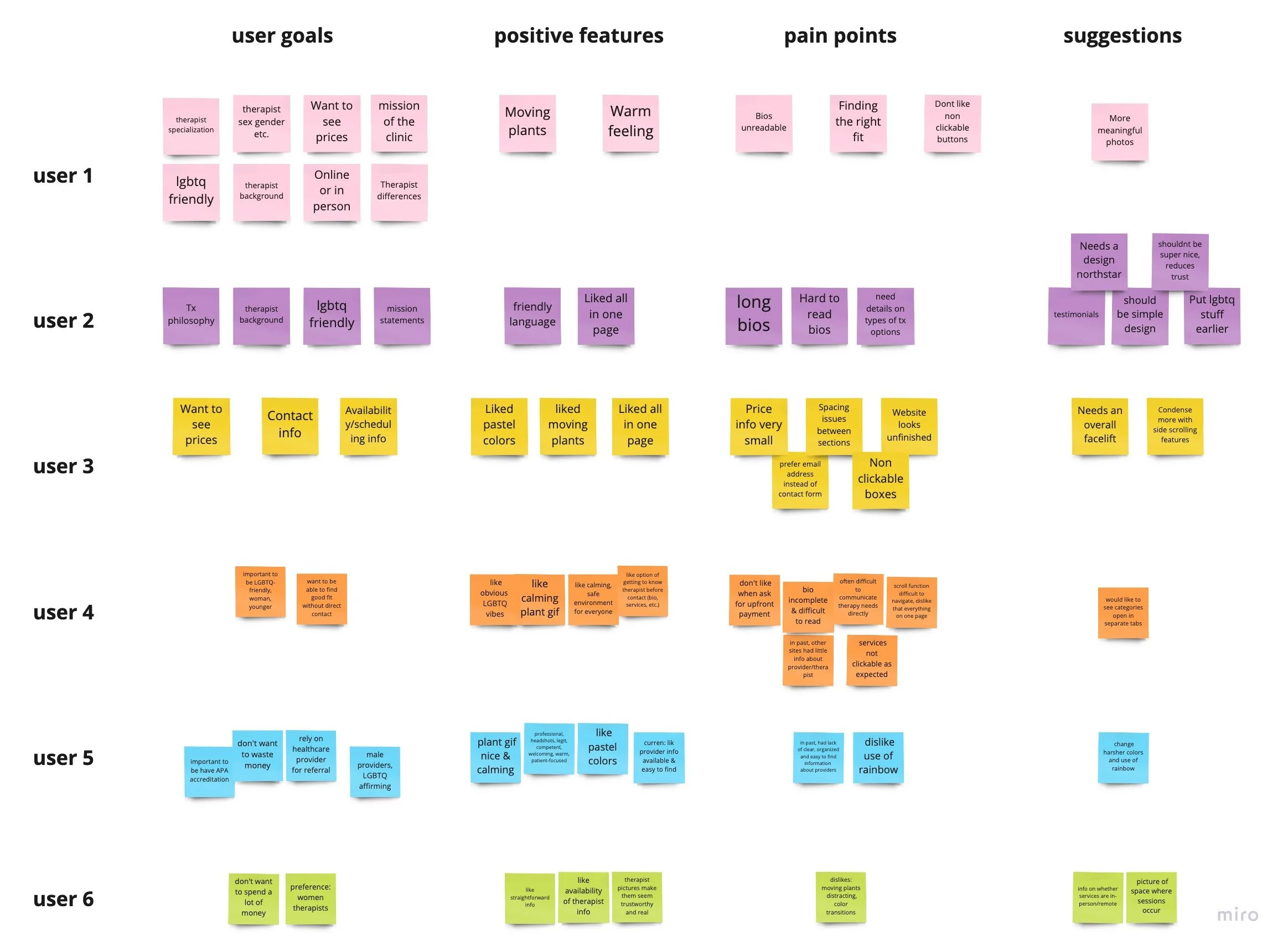
From user interviews, we saw what users most valued from a counseling website were
Provider information: mission statement, office location
Therapist information: therapist background, demographic, specialization, and availability
Finance: upfront prices, affordable
User Persona
Based on user interviews, we created a persona that guided our work and helped us in keeping the users in mind.
How did users feel about the current FCC’s website?
During usability testing, 3 out of 6 users (50%) succeeded in completing their assigned task. We hypothesized the main reasons for this low success rate were issues with:
Call-to-Action (CTA)
Information Architecture
Heuristics
Call-to-Action (CTA)
This is vital because it prompts users to take action toward their goals and pulls customers into the business’ sales funnel. We determined it would be best to have the CTA placed where users would want to learn more about the section.
Information Architecture
Structuring information to match user needs is important to help them easily find what they need and accomplish their goal. We looked at the different sections on the website and assessed which were important to users.
Heuristics
This is essential for users to make decisions and solve problems quickly. We conducted a quick heuristics analysis on the current website and discovered problems with:
Consistency
Readability
Minimalism
“There’s a lot to read but good and bad, good to read about therapist but hard to find the information I need.”
“This website is unprofessional and unreliable and makes me wanna go to another website.”
The imperfect process: challenges with constraints, content, and compromise
Challenge #1: Constraints within Wix
One of the challenges we encountered while building out the website was understanding Wix’s features and what we could in it. After going into Wix and testing its functionality, we realized how limited its features were and that many of our original designs could not be implemented in it. Therefore we had to update our designs based on Wix’s current capabilities.
Challenge #2: Short and Meaningful Content
Another challenge was figuring out how to apply the content the client requested without overwhelming users with excessive text. In this case, we worked with the client to create short and concise content that communicated the business’ message and was meaningful to users.
Challenge #3: Persuading the Client
There were many things about the website that the client disliked but the users liked, and vice versa. One of which was having all the website’s sections on a single scrollable page. Our client disliked it because of how it looked, but users enjoyed being able to quickly browse and jump to different sections without being redirected to another page. Here, we advocated for the users and convinced our client to keep the single scrollable page by quoting user feedback.
The reimagined counseling website
Wireframes
Style Guide
Based on client feedback, we created a style guide that included typography, color palette, and a mood board. This helped us maintain consistency throughout our designs.
Landing Page
This page is the first introduction that users have when visiting the site so we wanted it to be meaningful and valuable (USP headline), have a visual representation of services offered (hero), be a way for customers to complete their goal (CTA button), and include a summary of services.
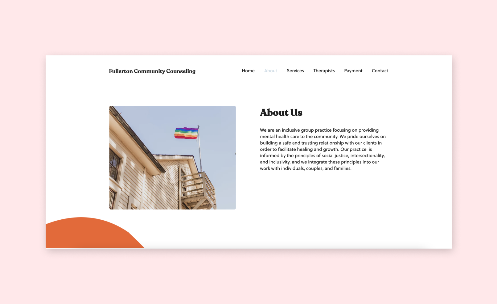
About Page
In addition having a landing page, our client was adamant about having the mission statement and business information of their website. Here, we included an image that represents the business and a short description of the business.
Services Page
Users were confused on whether or not the containers in this were clickable and wanted more information on the services offered, so we provided users with a button that directs them to the Contact page.
Therapists Page
We wanted to balance the white space and content while making good use of the page so we condensed each therapist profile into fewer rows and created buttons for the contact information and biographies for users to get more in-depth information about each therapist.
Payment Page
We simplified this section by dividing the payment methods into their own sections and moved the therapist fee's into the Therapist page so users don’t have to retain information as they navigate between the different pages.
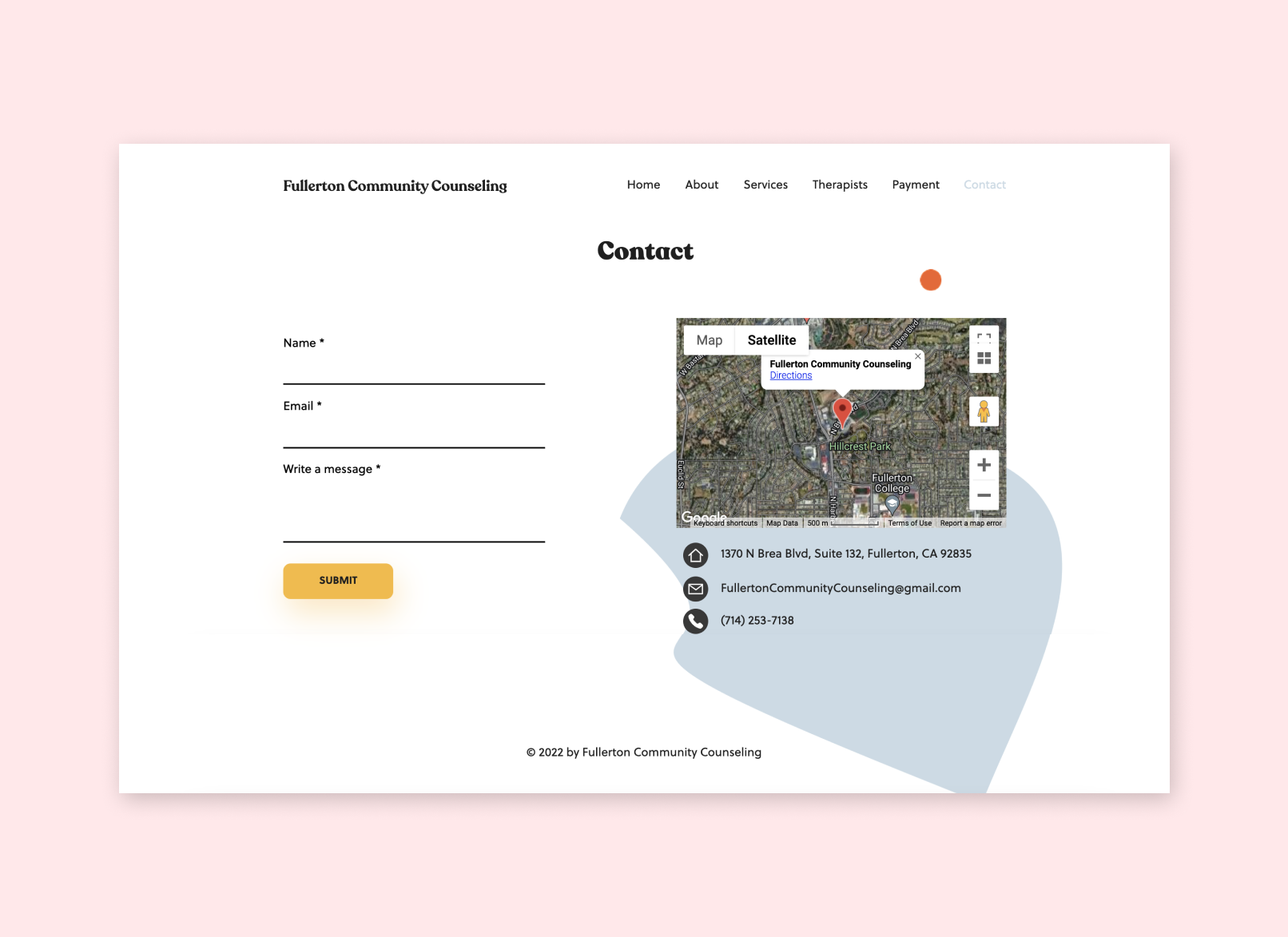
Contact Page
We reorganized this section to make better use of space by having the contact form and map next to each other.
Key Takeaways
This was the first time we’ve worked with a client so we were learning along the way. Some of the lessons we learned:
Trust your abilities! This was challenging because this was the first time a client had put their trust in us as a Designer and Researcher so there was the pressure to perform and deliver the best service. If we didn’t know something, we Googled it. If a client asked us something we didn’t know much about, we told them we would get back to them about it and conducted research on it.
Communication is key! We wanted to make sure our client stayed updated on our work so we sent bi-weekly updates and check-ins. This was important to keep the client engaged and confident in the direction of our work.
Ask questions! Our client was unsure on the details of their redesign vision so we had to do some probing along the way. “Why?” and “what do you think about this?” is something we found ourselves asking frequently.
When in doubt, ask users! We had so many questions on design choices that our users helped us decide on.
Next steps:
Conduct user testing
Collect metrics


